A quick observation: please try not to advertise this so prominently as being only for Windows! Because…
(a) As a Mac user, I tend to ignore anything 'modern' that's for Windows rather than Mac. I can run any Windows software on my Mac through Parallels, CrossOver etc., but I don't unless I have a reason to.
(b) More importantly (in a sense), I've only just discovered (through finding this game as a link in a retro collection) that you’ve also issued Spectrum and C64 versions! NOW we're talking! As a retro lover (particularly of the Spectrum), this is now of MUCH greater interest to me!
So, I've bought it for the retro versions.
I never expect to play the Windows edition, though, and had it not been for someone else including this game in a retro collection, the 'for Windows' label would have caused me to miss it forever, which would have been a shame! (In reality, it's just the sort of puzzle game that I like, so I'm doubly glad I checked.)
It’s actually the filters that promote it like this, but duly noted! In fact it started life as a ZX Spectrum exclusive but we wanted to see if we could make it more justice with better visuals! But , you’re right…this is prominently a retro puzzle game at heart!
And thank you for playing it , and glad you enjoyed it!
Ta for the game. Can you explain the anvil, granite, clock and road in more detail and what they look like on the Spectrum please - the ported graphics are pretty cryptic
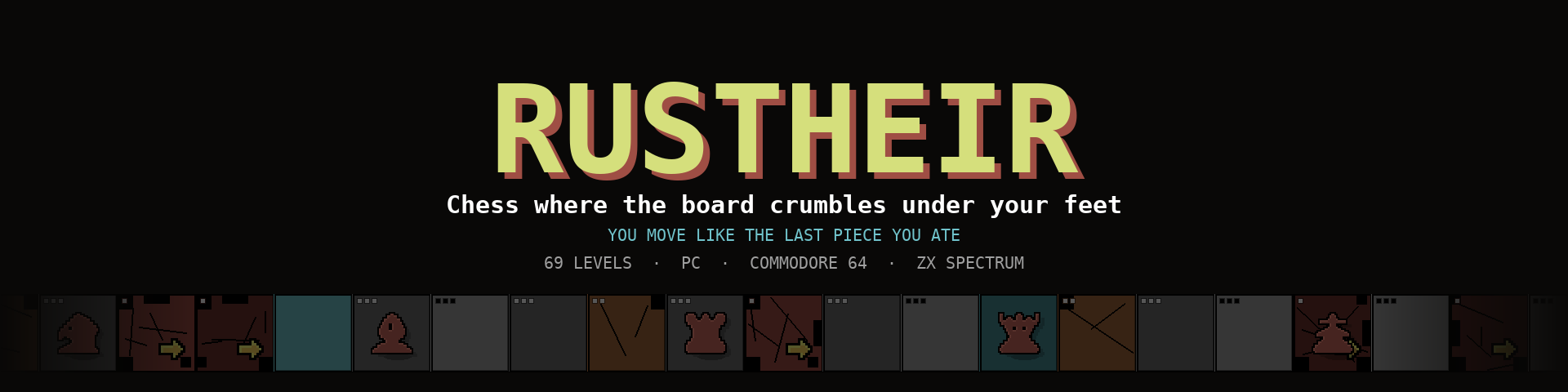
Thanks for buying it, and thanks for asking — that's a fair complaint. The Spectrum has eight colours and no room for icons, so everything had to be said with a colour, a texture or a tiny mark in the corner of a tile. Here's the whole vocabulary.
First, the plain ground. A tile has three lives, and its colour is how many are left: white = 3, yellow = 2, red = 1, black = gone. A worn tile also loses a bite out of its corners — one bite at 2, two at 1. The bright/dim alternation is just the chequerboard pattern; it means nothing about wear. And the little arrow in the bottom-right corner means "one more crossing and this square is gone" — step there and you can still stand, you just can't come back.
The anvil — solid magenta square. Land on it and it repairs the four squares directly north, south, east and west of it: each gains one life back. It works once, then it's spent. It never takes a tile above three lives, and it never brings back a hole — what has collapsed stays collapsed. Landing on it is the whole point; crossing over it does nothing.
The granite — solid cyan square. It never wears. Cross it as often as you like. It's the only permanent ground you're given for free, so in most levels the granite is the skeleton your route hangs off.
The clock — an hourglass in the top-left corner of a tile (from level 25 on). That tile rots on its own: it loses one life every three moves whether you touch it or not. The counter in the status bar marked ROT tells you how many moves until the next tick. When the tick is on your very next move, the hourglass turns red and flashes — that's your last warning. An anvil can hold a rotting tile up for one more round, because the clock ticks after your move, not before.
The road — a white brick texture (levels 65–69). These levels invert the game: the board starts half missing, and every tile you leave while it's still alive turns to brick and never wears again. You're building a road instead of burning bridges. The catch: a fragile tile dies the moment you step on it, so it's already dead when you leave — you can only pave ground that had something left in it.
Two more things that aren't obvious: your piece is the blue one; the enemies are black silhouettes on their own squares. And the gate (green) doesn't change appearance when it opens — the MEALS/EAT counter turns green instead. That's the only signal, and it's easy to miss.
One honest wart: on the Spectrum a spent anvil still looks magenta, so it lies to you after you've used it. On the PC version it goes back to looking like ordinary ground. That's an oversight rather than a design choice, and I'll fix it in the next build.
Hope that unlocks it. If any specific level is being stubborn, tell me the number and I'll tell you what it's testing
Re the graphics - I assume they're directly ported from the PC version without much tinkering? I see you're a member on the SC forum. If you were interested in doing any future updates, it might be worth posting the speccy graphics templates you have and seeing if any of the graphics wizards can suggest refinements? The chess pieces could be easily made less chunky for example.
Subject: Re: RustHeir — the name, and yes you're right about the graphics
The name: it's Rust + Heir, welded together. The game is two ideas merged. Rust is the board decaying under you — space as the resource you spend. Heir is the inheritance: you move like the last piece you ate, so you're always the heir of your last meal. The two halves are still readable in the word (rust·heir, and it also scans as ru·stheir), which felt right for a game where both mechanics are present in every single move. It also happens to be eight letters, which is exactly what fits on a Spectrum title screen without compromise — I'd like to claim that was foresight, but it was luck!!
The graphics: you're right!
They're not hand-drawn for the Spectrum at all. The pieces live as 12×12 one-bit bitmaps (literally text files with X's and spaces), and the build runs them through Scale2x to get the 24×24 that fills a 3×3 character tile. So every feature is at least two pixels wide in each direction — the Spectrum is being shown a doubled 12×12, not a real 24×24. That's exactly why they read as chunky. Same source feeds the PC and the C64, which was great for keeping three versions honest with each other, and terrible for the art.
So yes, I'd very much like to take you up on improving the graphics.
The one real complication I should flag: since those bitmaps currently feed all three versions, a hand-drawn Spectrum set means the build gains a per-platform art path. That's a small change and honestly the right one. We're just still juggling with preparing a number of projects at the same time, some of them on hold for quite some time since we lacked the people and technical know-how to proceed.
If you'd like a first look before I release the graphics update, just say the word and I'll send you the grids. And if any of the SC regulars want to have a go at the knight in particular, they'd be improving on something I already redrew twice — it was unrecognisable the first time round. So when I'll get the chance I will post there to gather opinions on the re-drawing!
Cheers for the nudge. This is the kind of note that actually improves a game.
← Return to game
Comments
Log in with itch.io to leave a comment.
A quick observation: please try not to advertise this so prominently as being only for Windows! Because…
(a) As a Mac user, I tend to ignore anything 'modern' that's for Windows rather than Mac. I can run any Windows software on my Mac through Parallels, CrossOver etc., but I don't unless I have a reason to.
(b) More importantly (in a sense), I've only just discovered (through finding this game as a link in a retro collection) that you’ve also issued Spectrum and C64 versions! NOW we're talking! As a retro lover (particularly of the Spectrum), this is now of MUCH greater interest to me!
So, I've bought it for the retro versions.
I never expect to play the Windows edition, though, and had it not been for someone else including this game in a retro collection, the 'for Windows' label would have caused me to miss it forever, which would have been a shame! (In reality, it's just the sort of puzzle game that I like, so I'm doubly glad I checked.)
It’s actually the filters that promote it like this, but duly noted! In fact it started life as a ZX Spectrum exclusive but we wanted to see if we could make it more justice with better visuals!
But , you’re right…this is prominently a retro puzzle game at heart!
And thank you for playing it , and glad you enjoyed it!
A nice puzzle game. I included it in a video alongside other games released in September.
Thank you so much for the presentation! Cheers !
Ta for the game. Can you explain the anvil, granite, clock and road in more detail and what they look like on the Spectrum please - the ported graphics are pretty cryptic
Thanks for buying it, and thanks for asking — that's a fair complaint. The Spectrum has eight colours and no room for icons, so everything had to be said with a colour, a texture or a tiny mark in the corner of a tile. Here's the whole vocabulary.
First, the plain ground. A tile has three lives, and its colour is how many are left: white = 3, yellow = 2, red = 1, black = gone. A worn tile also loses a bite out of its corners — one bite at 2, two at 1. The bright/dim alternation is just the chequerboard pattern; it means nothing about wear. And the little arrow in the bottom-right corner means "one more crossing and this square is gone" — step there and you can still stand, you just can't come back.
The anvil — solid magenta square. Land on it and it repairs the four squares directly north, south, east and west of it: each gains one life back. It works once, then it's spent. It never takes a tile above three lives, and it never brings back a hole — what has collapsed stays collapsed. Landing on it is the whole point; crossing over it does nothing.
The granite — solid cyan square. It never wears. Cross it as often as you like. It's the only permanent ground you're given for free, so in most levels the granite is the skeleton your route hangs off.
The clock — an hourglass in the top-left corner of a tile (from level 25 on). That tile rots on its own: it loses one life every three moves whether you touch it or not. The counter in the status bar marked ROT tells you how many moves until the next tick. When the tick is on your very next move, the hourglass turns red and flashes — that's your last warning. An anvil can hold a rotting tile up for one more round, because the clock ticks after your move, not before.
The road — a white brick texture (levels 65–69). These levels invert the game: the board starts half missing, and every tile you leave while it's still alive turns to brick and never wears again. You're building a road instead of burning bridges. The catch: a fragile tile dies the moment you step on it, so it's already dead when you leave — you can only pave ground that had something left in it.
Two more things that aren't obvious: your piece is the blue one; the enemies are black silhouettes on their own squares. And the gate (green) doesn't change appearance when it opens — the MEALS/EAT counter turns green instead. That's the only signal, and it's easy to miss.
One honest wart: on the Spectrum a spent anvil still looks magenta, so it lies to you after you've used it. On the PC version it goes back to looking like ordinary ground. That's an oversight rather than a design choice, and I'll fix it in the next build.
Hope that unlocks it. If any specific level is being stubborn, tell me the number and I'll tell you what it's testing
Cheers. Why's it called RustHeir btw?!
Re the graphics - I assume they're directly ported from the PC version without much tinkering? I see you're a member on the SC forum. If you were interested in doing any future updates, it might be worth posting the speccy graphics templates you have and seeing if any of the graphics wizards can suggest refinements? The chess pieces could be easily made less chunky for example.
Subject: Re: RustHeir — the name, and yes you're right about the graphics
The name: it's Rust + Heir, welded together. The game is two ideas merged. Rust is the board decaying under you — space as the resource you spend. Heir is the inheritance: you move like the last piece you ate, so you're always the heir of your last meal. The two halves are still readable in the word (rust·heir, and it also scans as ru·stheir), which felt right for a game where both mechanics are present in every single move. It also happens to be eight letters, which is exactly what fits on a Spectrum title screen without compromise — I'd like to claim that was foresight, but it was luck!!
The graphics: you're right!
They're not hand-drawn for the Spectrum at all. The pieces live as 12×12 one-bit bitmaps (literally text files with X's and spaces), and the build runs them through Scale2x to get the 24×24 that fills a 3×3 character tile. So every feature is at least two pixels wide in each direction — the Spectrum is being shown a doubled 12×12, not a real 24×24. That's exactly why they read as chunky. Same source feeds the PC and the C64, which was great for keeping three versions honest with each other, and terrible for the art.
So yes, I'd very much like to take you up on improving the graphics.
The one real complication I should flag: since those bitmaps currently feed all three versions, a hand-drawn Spectrum set means the build gains a per-platform art path. That's a small change and honestly the right one. We're just still juggling with preparing a number of projects at the same time, some of them on hold for quite some time since we lacked the people and technical know-how to proceed.
If you'd like a first look before I release the graphics update, just say the word and I'll send you the grids. And if any of the SC regulars want to have a go at the knight in particular, they'd be improving on something I already redrew twice — it was unrecognisable the first time round. So when I'll get the chance I will post there to gather opinions on the re-drawing!
Cheers for the nudge. This is the kind of note that actually improves a game.